Plots.jl
The Plots package is not a standard plotting package known from other languages. The Plots package provides a unified interface and toolset for creating plots. The plots themselves are drawn by different backends, like GR, PyPlot, PGFPlotsX, or Plotly. If one backend does not support desired features, it is possible to switch to another backend with one command without any further changes to the code.
Compared to Python or Matlab, it takes some time to create the first plot in a new Julia session. In Julia, all functions are compiled during their first run, which slows the first run down.
The core of the Plots package is the plot function that provides an interface for creating all types of plots. The default plot style is the line style. The line plot can be created by calling the plot function on two vectors.
using Plots
x = range(0, 2π; length = 100)
y = sin.(x)
plot(x, y)
Depending on the environment and backend, the plot is displayed in a plot pane, a stand-alone window, or the browser, see the official documentation for more details. Each input column is treated as a separate plot series. Thus, it is possible to create multiple plots at once.
y = hcat(sin.(x), cos.(x))
plot(x, y)
To add a new curve to an existing plot can be done by the plot! function. This follows the standard Julia practice that functions with ! modify inputs.
plot!(x, sin.(x .+ π/4))The Plots package determines the current plot by employing the global variable Plots.CURRENT_PLOT. It is possible to name a figure and use it later for plotting.
plt = plot(x, hcat(sin.(x), cos.(x)))
plot!(plt, x, sin.(x .+ π/4))
Plot attributes
So far, we did not change any style in the plots. The Plots package provides a large number of plot attributes to modify the plot appearance. The package follows a simple rule: Positional arguments are data (which should be plotted), while keyword arguments are attributes (which modify the style). This list of attributes includes:
label: the label for a series, which appears in a legend.xguide,yguide: axis guide (label).legend: legend position.title: plot title.xticks,yticks: position and labels for ticks.color: series color.linestyle: style of the line.linewidth: width of the line.
The names of the attributes are in almost all cases intuitive and sufficiently descriptive.
x = range(0, 2π; length = 100)
y = hcat(sin.(x), cos.(x))
plot(x, y;
    label = ["sine" "cosine"],
    xguide = "x",
    yguide = "y",
    legend = :bottomleft,
    title = "Trigonometric functions",
    xticks = (0:0.5π:2π, ["0", "0.5π", "π", "1.5π", "2π"]),
    color = [:red :blue],
    linestyle = [:dash :dot],
    linewidth = [2 4],
)
We use multiple values for some attributes to use a different setting for both curves. The logic is the same as for input data: each column corresponds to one series. Therefore, we have to use row vectors. When column vectors are used for attributes, the different values are applied to data points.
The following example creates a sine function plot from n data points. As a linewidth attribute, we use a range from 1 to 50 of length n: each point will be of different width. The same applies to the color attribute. We use the palette function to generate n colors from the viridis color scheme. Then each color is applied to one point.
n = 200
x = range(0, 2π; length = n)
linewidth = range(1, 50; length = n)
color = palette(:viridis, n)
xlims = (0, 7)
ylims = (-1.2, 1.2)
label = ""

plot(x, sin.(x); linewidth, color, label, xlims, ylims)
It is possible to use both column and row vectors as attributes at the same time. In the following example, we add a cosine function into the previous plot and set its color to red.
plot(x, [sin.(x) cos.(x)]; linewidth, color = [color :red], label, xlims, ylims)There is a large number of attributes. The Plots package provides the plotattr function to print all attributes for series, plots, subplots, or axes.
julia> plotattr(:Series)Defined Series attributes are:
arrow, bar_edges, bar_position, bar_width, bins, colorbar_entry, connections, contour_labels, contours, extra_kwargs, fill_z, fillalpha, fillcolor, fillrange, fillstyle, group, hover, label, levels, line_z, linealpha, linecolor, linestyle, linewidth, marker_z, markeralpha, markercolor, markershape, markersize, markerstrokealpha, markerstrokecolor, markerstrokestyle, markerstrokewidth, normalize, orientation, permute, primary, quiver, ribbon, series_annotations, seriesalpha, seriescolor, seriestype, show_empty_bins, smooth, stride, subplot, weights, x, xerror, y, yerror, z, z_order, zerror
The plotattr function accepts any of the following arguments: :Plots, :Series, :Subplot, and :Axis. It is also possible to use the plotattr function to print a concrete attribute description.
julia> plotattr("title"):title

Subplot title.

Aliases: (:titles,).

Type: AbstractString.

`Subplot` attribute
The example above uses a String instead of Symbol. Be aware that not all attributes are supported. Attributes that can be specified for different axes, such as xguide and yguide, are often not supported.
julia> plotattr("xguide")ERROR: There is no attribute named xguide
Descriptions for these attributes can be found using the attribute name without the axis specification, i.e., guide instead of xguide.
julia> plotattr("guide"):guide

Axis guide (label).

Type: AbstractString.

`Axis` attribute
Consider the following set of equations
\[\begin{aligned} x(t) & = \cos(3t), \\ y(t) & = \sin(2t),\\ \end{aligned}\]
where $t \in [0, 2\pi]$. Create a plot of the curve described by the equations above. Use plot attributes to set the following properties
- The line width should start at
1, increase to50and then decrease back to1. - The line color should change with the changing line width.
Use :viridis color scheme or any other color scheme supported by the Plots package. Use additional plot attributes to get a nice looking graph.
Hints:
- use the
palettefunction combined with thecollectfunction to generate a vector of colors from the:viridiscolor scheme. - remove all decorators by using:
axis = nothing,border = :none.
Solution:
We first define vector t by the range function with a predefined length.
n = 1000
t = range(0, 2π; length = n)
Then we define functions described by the set of equations in the exercise description.
fx(t) = cos(3t)
fy(t) = sin(2t)
Since we want to use different plot attributes for each point, the attributes will have length n. Since the linewidth should first increase and then decrease, we use twice range and then vcat them into one column vector.
linewidth = vcat(
    range(1, 50; length = n ÷ 2),
    range(50, 1; length = n - n ÷ 2)
)
We used integer division to set the length in the range function. In the same way, we can create a vector of colors. The Plots package provides the palette function that allows generating equidistantly spaced colors from a color scheme.
julia> c = palette(:viridis, 2);julia> typeof(c)ColorPalette
The palette function returns the ColorPalette type. Since we want to concatenate two vectors of colors together, we have to use the collect function to extract the vector of colors from the ColorPalette type.
julia> c = collect(palette(:viridis, 2))2-element Vector{Any}:
 RGB{Float64}(0.267004,0.004874,0.329415)
 RGB{Float64}(0.993248,0.906157,0.143936)
Now we can use a similar code as before in combination with the rev keyword to change the order.
color = vcat(
    collect(palette(:viridis, n ÷ 2)),
    collect(palette(:viridis, n - n ÷ 2; rev = true))
)
Finally, we can call the plot function with input arguments and attributes defined above. We use axis = nothing and border = :none to remove all decorators such as ticks or axis frame.
plot(fx.(t), fy.(t);
    linewidth,
    color,
    lims = (-1.2, 1.2),
    legend = false,
    axis = nothing,
    border = :none,
)
"/home/runner/work/Julia-for-Optimization-and-Learning/Julia-for-Optimization-and-Learning/docs/build/lecture_05/plot_exercise1.svg"
Function plotting
The previous section showed basic functionality of the plot function. We first calculated the values to be plotted and then created the graphs. However, it is possible to pass functions directly to the plot function.
t = range(0, 2π; length = 100)
plot(t, [sin, cos]; label = ["sine" "cosine"])
It is even possible to pass two functions first and then the vector of values, where these functions will be evaluated.
plot(sin, x -> sin(2x), t; linewidth = 2, label = "")Instead of a vector of values, we can also use a similar syntax as for ranges with the starting point, stopping point, and optionally length.
plot(sin, x -> sin(2x), 0, 2π, 100; linewidth = 2, label = "")Create a plot given by the following set of equations:
\[\begin{aligned} x(t) & = (a + b)\cos(t) - b \cdot \cos \left( \left(\frac{a}{b} + 1 \right)t \right), \\ y(t) & = (a + b)\sin(t) - b \cdot \sin \left( \left(\frac{a}{b} + 1 \right)t \right), \\ \end{aligned}\]
where $a = 4.23$, $b = 2.35$ and $t \in [-15, 20]$. Use additional plot attributes to get a nicely looking graph.
Solution:
This exercise is straightforward. We first define the functions described by the set of equations.
fx(t; a = 4.23, b = 2.35) = (a + b)*cos(t) - b*cos((a/b + 1)*t)
fy(t; a = 4.23, b = 2.35) = (a + b)*sin(t) - b*sin((a/b + 1)*t)
Now we plot these functions.
plot(fx, fy, -15, 20, 500;
    linewidth = 2,
    legend = false,
    axis = nothing,
    border = :none,
)
"/home/runner/work/Julia-for-Optimization-and-Learning/Julia-for-Optimization-and-Learning/docs/build/lecture_05/plot_exercise2.svg"
Changing the plotting series
The previous section used only line plots. However, there are many other series types, such as scatter plots, heatmaps, or contours. One way to change the plot series is the seriestype attribute. The following example plots the sine function by the scatter series type.
x = range(0, 2π; length = 100)
y = sin.(x)
plot(x, y; seriestype = :scatter)
The second way is to use a specialized function provided for each series type. These functions have the same name as the corresponding series type.
scatter(x, y)Consider the following function:
\[f(x, y) = \frac{x^2 \cdot y^2}{x^4 + y^4}.\]
Draw this function for $x, y \in [-5, 5]$. Use the following three plot series contourf, heatmap, and surface with the following settings:
:viridiscolor scheme,- camera angle
(25, 65), - no legend, color bar, or decorators (
axis,frameandticks).
Solution:
As usual, we first define the function and the values, where it will be evaluated.
x = range(-5, 5; length = 200)
fz(x, y) = x^2*y^2/(x^4 + y^4)
Since we want to create three different plots with the same attributes, we create a named tuple to store the attribute values. This allows us to reuse them.
kwargs = (
    color = :viridis,
    legend = false,
    cbar = false,
    axis = nothing,
    border = :none,
)
We can use the plot function with the seriestype = :contourf keyword to draw a filled contour plot. The simpler option is to use the contourf function.
contourf(x, x, fz; kwargs...) # or plot(x, x, fz; seriestype = :contourf, kwargs...)
We used the triple-dot syntax to unpack keyword arguments. Recall that in this case, the semi-colon is mandatory. Similarly, we can draw the heatmap plot.
heatmap(x, x, fz; kwargs...)
For the surface plot, we can change the camera angle by setting the camera attribute.
surface(x, x, fz; camera = (25, 65), kwargs...)
Subplots
Sometimes it is useful to create a plot with multiple subplots. The Plots package provides the layout keyword to do so.
x = range(0, 2π; length = 100)
plot(x, [sin, cos, tan, sinc];
    layout = 4,
    linewidth = 2,
    legend = false,
    title = ["1" "2" "3" "4"],
)
This example creates four curves at once. The layout keyword tells Plots package to draw each curve in a separate subplot. Attributes with multiple values (row vectors) apply each value to one subplot. The Plots package also provides the grid function used to create a subplot grid manually. For example, we can easily change the grid to 4x1 and set the height of each subplot.
plot(x, [sin, cos, tan, sinc];
    layout = grid(4, 1; heights = [0.1 ,0.4, 0.4, 0.1]),
    linewidth = 2,
    legend = false,
)
It is possible to create more advanced layouts with the @layout macro. In the example below, we create a non-symmetric layout with one subplot in the first row and two subplots in the second row. Moreover, we set the width of the first subplot in the second row to be 0.3 of the whole plot width.
l = @layout [a ; b{0.3w} c]
plot(x, [sin, cos, tan]; layout = l, linewidth = 2, legend = false)
All examples above can also be created incrementally. To recreate the last graph, we first create three plots.
linewidth = range(1, 20; length = 100)
p1 = plot(x, sin; legend = false, line_z = 1:100, color = :viridis, linewidth)
p2 = plot(x, cos; legend = false, line_z = 1:100, color = :Blues_9, linewidth)
p3 = plot(x, tan; legend = false, line_z = 1:100, color = :hsv, linewidth)
The line_z keyword allows for applying different colours to different points. Then we can use the plot function and the layout keyword to create the final plot.
l = @layout [a ; b{0.3w} c]
plot(p1, p2, p3; layout = l)
Animations
The following example creates an animation by updating an existing curve. We first create an empty graph and specify all its attributes.
n = 300
plt = plot(Float64[], [sin, cos];
    legend = false,
    xlims = (0, 6π),
    ylims = (-1.1, 1.1),
    linewidth = range(1, 20; length = n),
    color = palette(:viridis, n),
    axis = nothing,
    border = :none
)
Then we create an empty animation by the Animation function.
anim = Animation()Finally, we use the for loop and the frame function to create an animation. The second line uses the push! function to append new points to the plt plot defined before. The frame function captures the current state of the plt plot and creates a new frame for the animation.
for x in range(0, 6π; length = n)
    push!(plt, x, [sin(x), cos(x)])
    frame(anim)
end
When the animation is created, we can save it as a gif using the gif function.
gif(anim, "animsincos.gif", fps = 15)
Another way how to create an animation is by the @animate macro. We now create the following 3D surface plot.
x = range(-5, 5; length = 400)
fz(x, y) = x^2*y^2/(x^4 + y^4)
plt = surface(x, x, fz;
    camera = (30, 65),
    color = :viridis,
    legend = false,
    axis = nothing,
    border = :none,
    cbar = false,
)
We can create an animation by modifying some parameters of the plot. For example, to change the camera angle, we use the plot! function with the camera keyword arguments.
anim = @animate for i in vcat(30:60, 60:-1:30)
    plot!(plt, camera = (i, 65))
end
Finally, we save the animation by the gif function as in the previous example.
gif(anim, "animsurf.gif", fps = 15)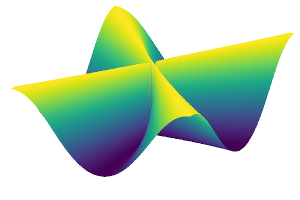
Integration with other packages
Plots package provides a simple way of defining special plots for custom data types using the so-called recipes (recipes are defined in a stand-alone package RecipeBase). By defining custom recipes, it is possible to change the data preprocessing before they are plotted. Many packages provide specialized plot recipes. For example, StatsPlots provides recipes for plotting histograms and boxplots or violin plots. This package also offers recipes to treat DataFrames and Distributions, allowing simple plotting of tabular data and distributions.